

The Borough Brand Identity Design & Illustration
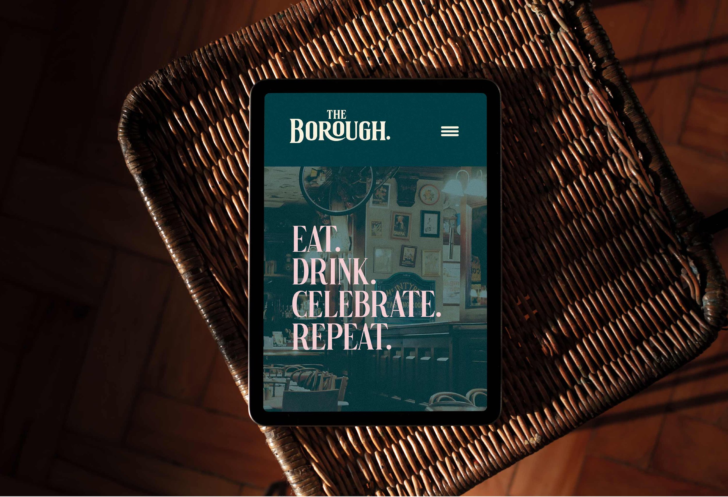
Nestled in the lively heart of Maidenhead since the 1850s, The Borough building has been a go-to spot for good spirits and great times. Jacob had a vision to elevate his wine bar and restaurant, and he brought me in to craft a brand identity that strikes the perfect balance between sophistication and approachability.
Imagine a vibe that's refined and with a nod to old-school charm. Jacob was keen on characters reminiscent of classic book illustrations and vintage details, all aimed at celebrating the pleasures of good food, fine wine, and warm company.
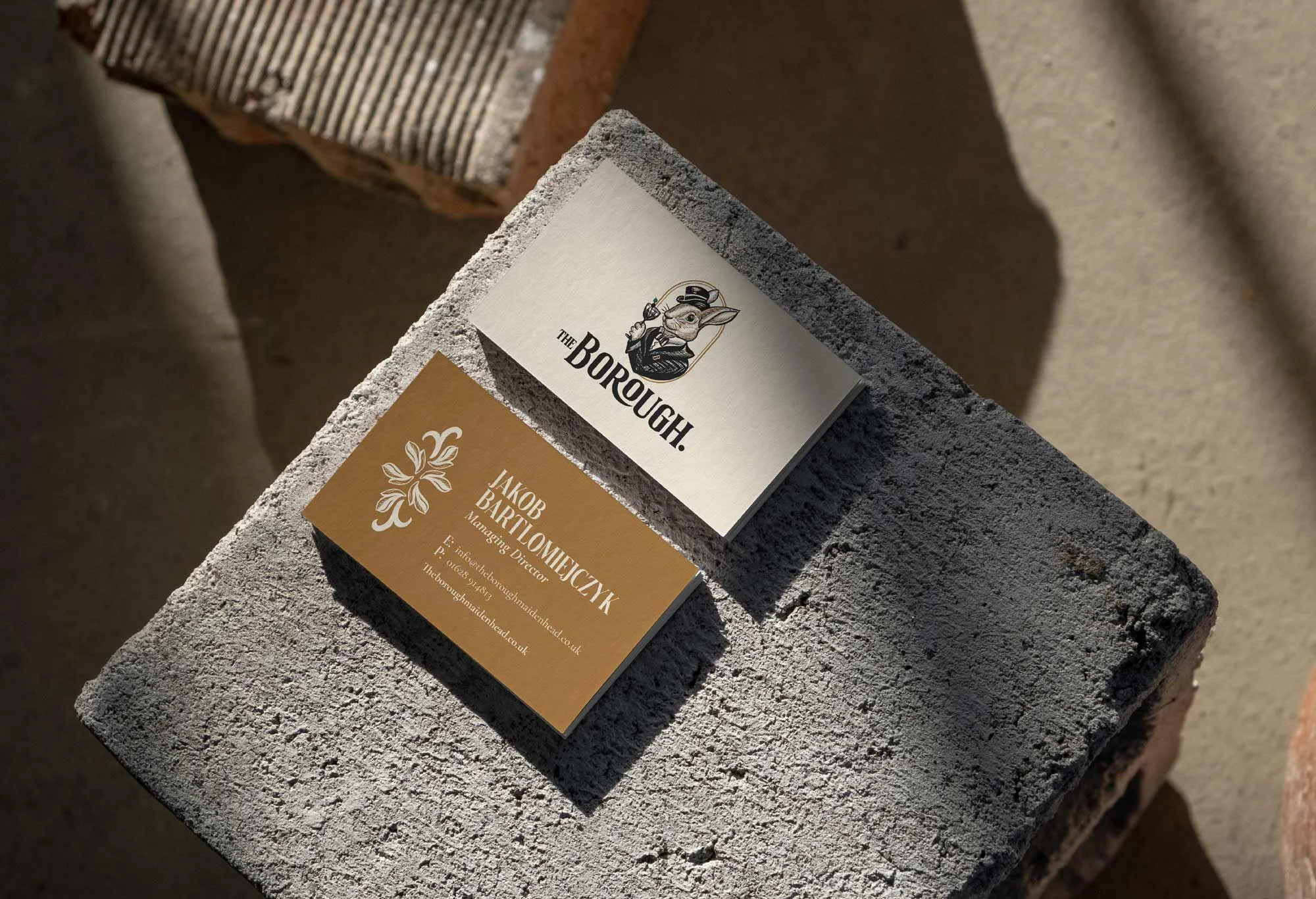
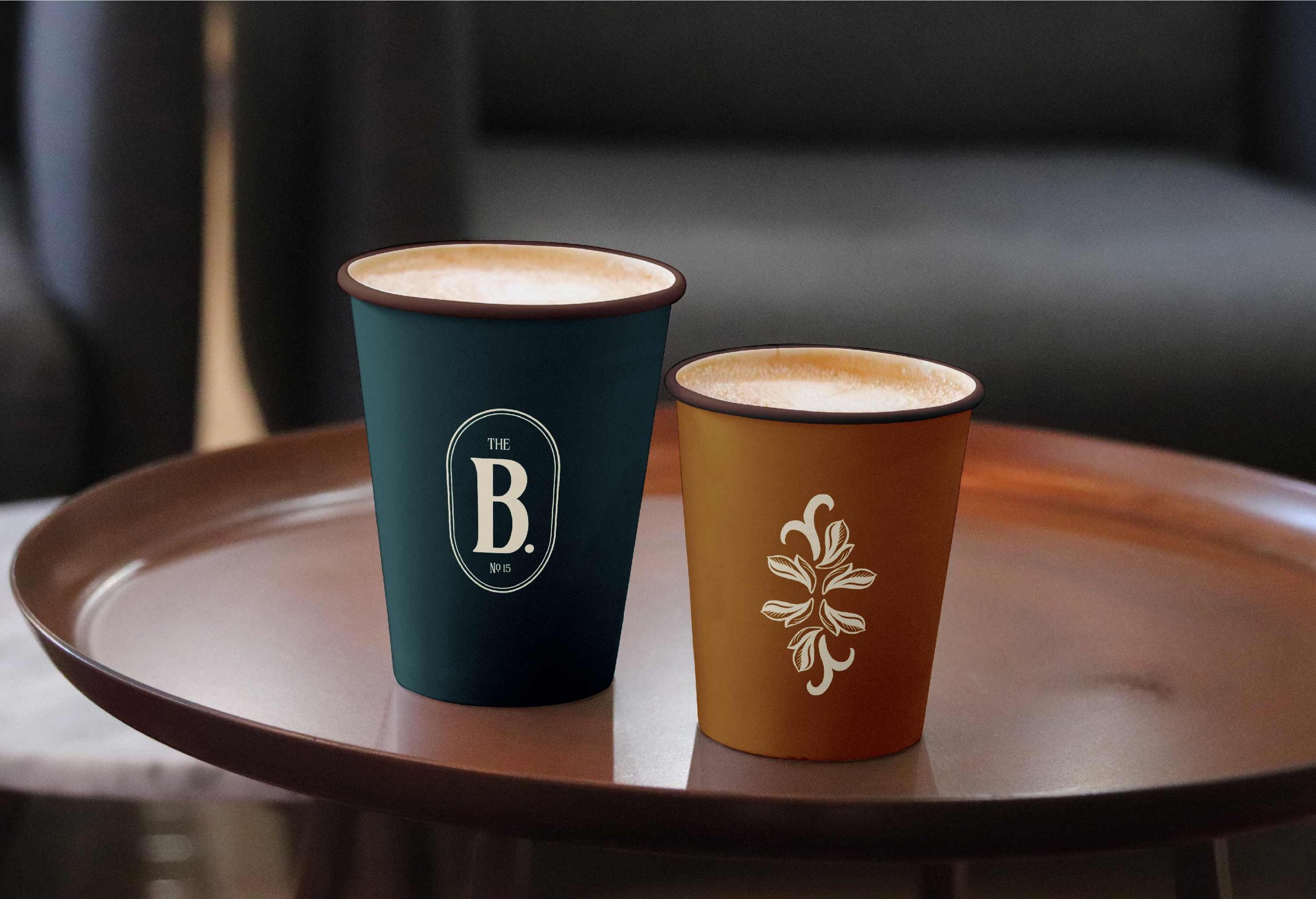
Since "Burrow" and "Borough" are practically BFFs, we went for a laid-back Royal Rabbit mascot, paired with a timeless typeface. Additional illustrations were introduced to add depth and interest. The framed B monogram proved to be a practical and versatile touch, ideal for smaller spaces, stickers, and various iconography.
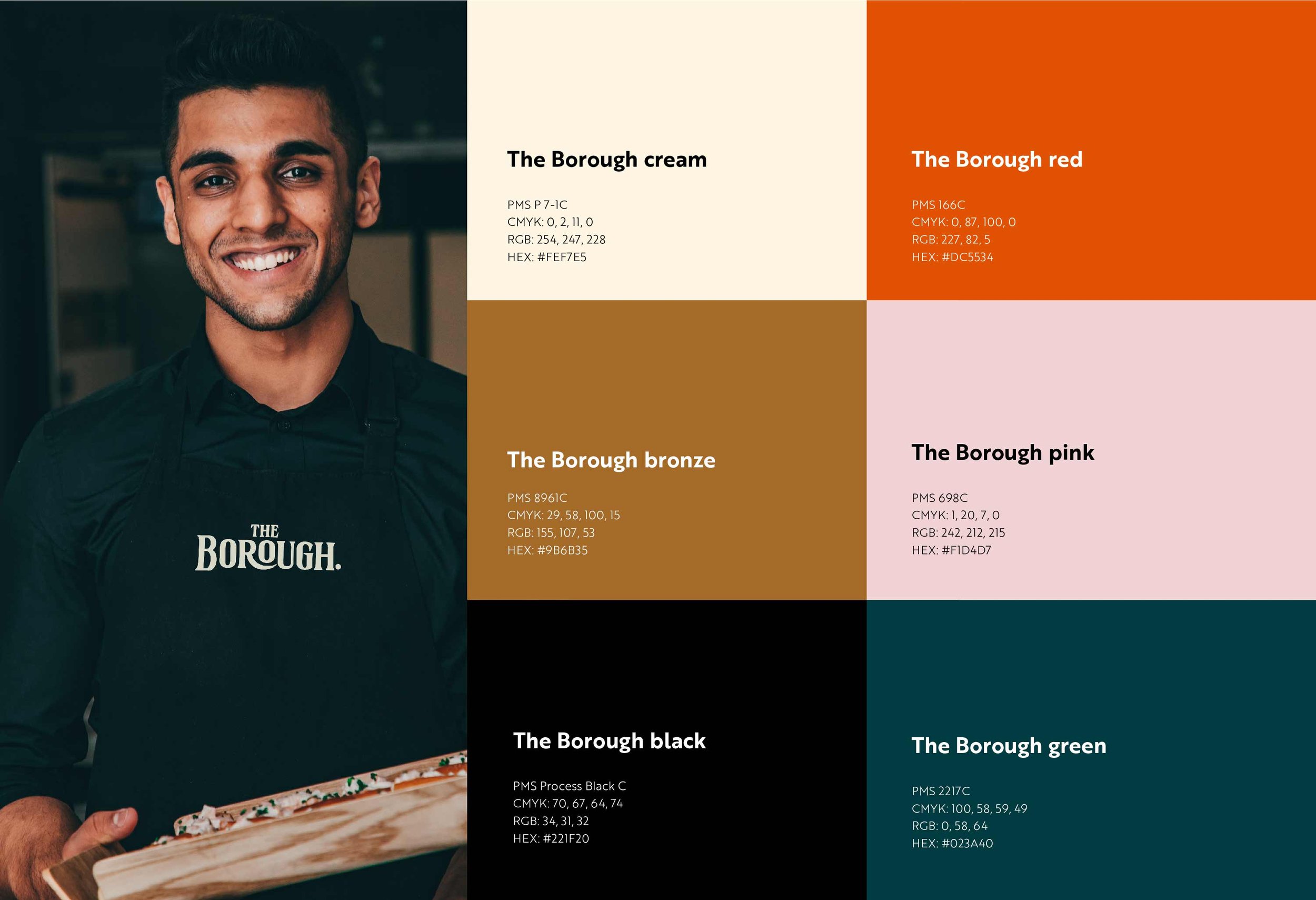
Colours? Think vintage, but not too serious – with a pop of red and pink to keep things interesting. And guess what? Here's the big reveal! It's a blend of history, charm, and a whole lot of good vibes – just like Jacob's place, where you're always welcome for a glass, a plate, and a good time. 🍷✨
services
A WELL SET BRAND PACKAGE
LOGO / BRAND IDENTITY DESIGN
ILLUSTRATION
BRAND ASSETS